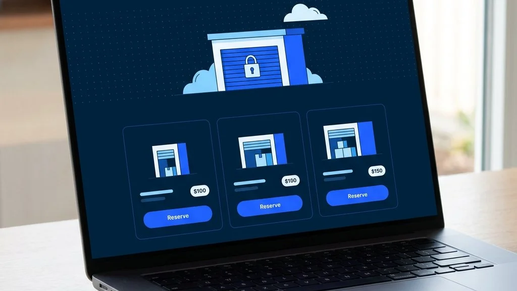
A self storage website has one job: turn a visitor looking for space into a booked, paying customer. Plenty of storage sites look tidy but quietly leak enquiries because they make people work too hard. These are the nine elements that consistently separate a website that converts from one that just informs, with practical detail on how to get each one right.
This is the single biggest conversion lever on a self-storage website, and most operators get it wrong. Showing a static unit list with a “call for pricing” prompt is not enough. Customers comparing options will move to a competitor whose site shows them exactly what is available, at what price, right now.
Live availability does several things at once. It removes the main reason someone picks up the phone rather than booking. It signals that your facility is modern and well-run. And it allows a customer to complete the entire decision at their own pace, at any hour, without waiting for you to reply.
If you run on Stora, Amax Connect syncs your live unit inventory directly to your website, with prices updated automatically whenever you change them in Stora.
Every page on your site should make the next step obvious. For most self-storage websites, that step is “Reserve” or “Book now”. The problem is that many sites present four or five options simultaneously: call us, email us, fill in this form, view our prices, download a brochure. Competing options dilute intent and increase the chance a visitor does nothing.
Pick one primary action per page and make it the most visually prominent element below the headline. Secondary options (contact us, learn more) should be clearly subordinate. The rule is simple: if someone lands on your page with 30 seconds to decide, they should know instantly what to click.
Most storage customers have never rented a unit before. They have no frame of reference for what 25 sq ft or 100 sq ft means in practice. If your size guide lists square footage without context, customers will either call to ask or abandon the decision.
The fix is to anchor every size to something familiar:
Adding what each size is typically used for (student storage, business archive, house move, vehicle parts) helps customers self-qualify and choose with confidence rather than calling to check.
Hidden administration fees, insurance requirements buried in the small print, and vague “from” pricing all erode trust at the moment it matters most. A customer who reaches your booking flow and discovers the price is 20% higher than advertised will abandon and look elsewhere.
Show the real monthly price. If there is a deposit, say so and say how much. If insurance is required, include a typical figure. If you offer an introductory discount, show the full price and the discounted price together so the saving is clear.
Transparent pricing does not just reduce friction at checkout. It filters out tyre-kickers and attracts customers who are ready to commit, which means fewer wasted calls and a higher booking rate from your organic traffic.
A storage customer is handing over access to their possessions, often for months. Trust is not optional. For most operators, the key signals are:
More than half of all self-storage searches happen on a mobile device. A site that loads slowly, requires pinching and zooming, or has buttons too small to tap on a phone will lose a large share of the people who found it.
Practical targets:
Test your site with Google PageSpeed Insights and work through the recommendations. A slow storage site on mobile is leaking bookings every day.
The booking flow is where most storage websites lose customers who were ready to convert. Common failure points include:
The benchmark is an Amazon-style checkout: as few steps as possible, clear progress, card payment that works first time, and an immediate confirmation email. Every additional step in your booking flow costs you a percentage of completions.
Every unanswered question on a storage website is a reason to pick up the phone rather than book, or to leave and not come back. The questions that come up most often are predictable:
Address these on your main pages, not just in a buried FAQ. A short answers section near the bottom of each page reduces calls, reduces friction and signals to Google that the page is genuinely useful to a potential customer.
A website that converts is only useful if people can find it. The SEO basics are straightforward but often overlooked:
Local SEO and conversion rate are connected: a well-structured page that clearly explains what you offer, where you are, and what customers think of you will rank better and convert more of the traffic it receives.
You do not need a large site or a large budget to convert storage customers well. You need a focused site that gets these nine elements right: live availability, a single clear action, sizes explained plainly, honest pricing, visible trust signals, fast mobile pages, a simple booking flow, pre-empted questions, and solid local SEO.
If you run on Stora, Amax Connect handles the technically complex parts: live unit availability, current pricing and a complete booking and payment flow, all on your own WordPress site. See it working on the live demo.
Amax Connect puts your live Stora availability and prices straight onto your site, with bookings and payments built in. Take a look, or let us walk you through it.